Birdy.io
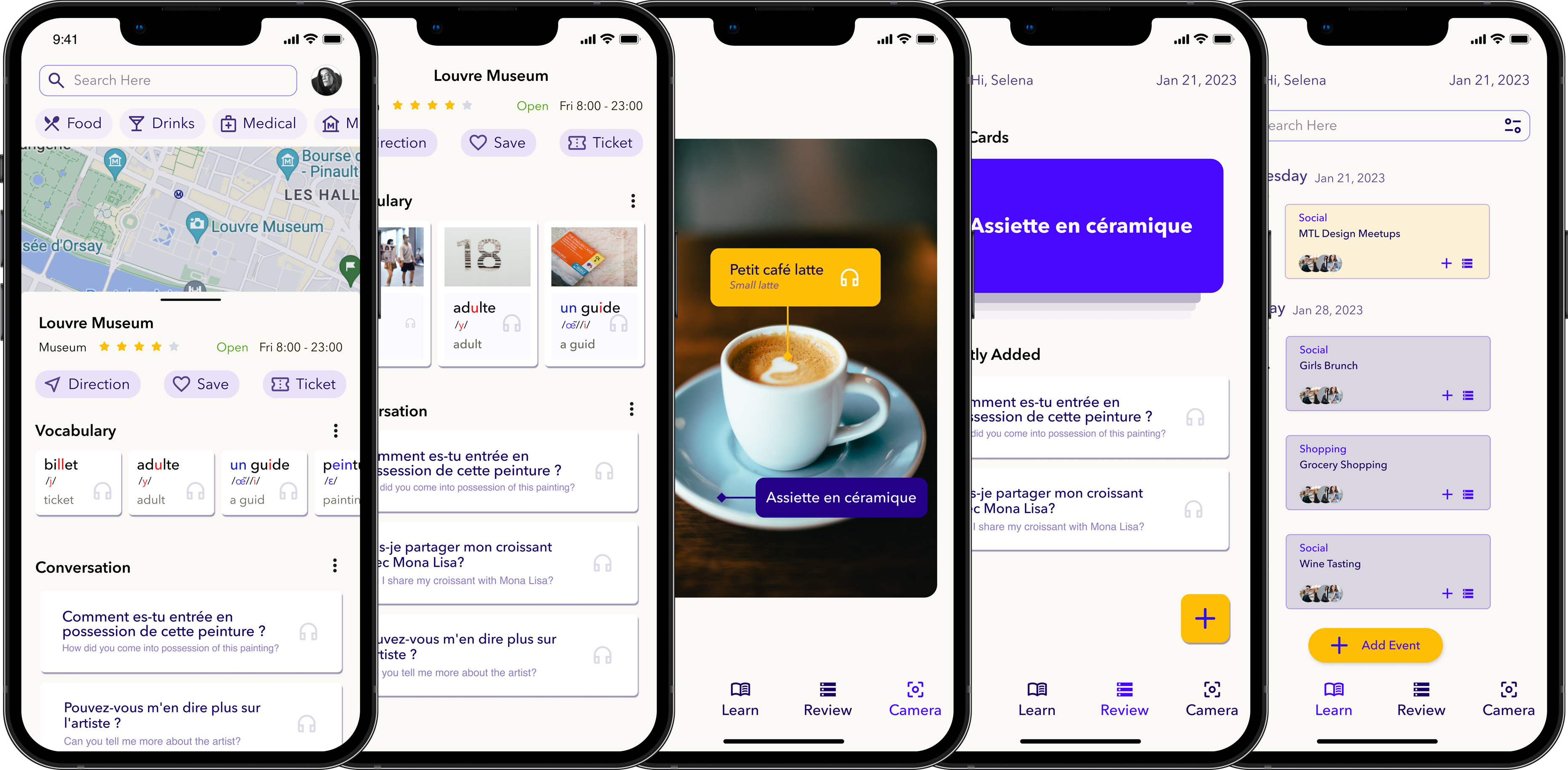
Birdy.io is a context-based (location and calendar) language-learning app. Its purpose is to assist busy professionals in mitigating the effects of the forgetting curve by providing them with relevant learning materials.
My goal is to address a personal challenge I face as a new immigrant in a French-speaking society and as a frequent traveler. I have invested a considerable amount of time in interviewing fellow immigrants and conducting tests to gather feedback.
MY ROLE
Product Designer
TOOLs
Figma, Keynote, Notion
Scope
User Research, Interaction & Visual Design, Prototyping & Testing, Pitching
PROBLEM
Busy & Forgetting
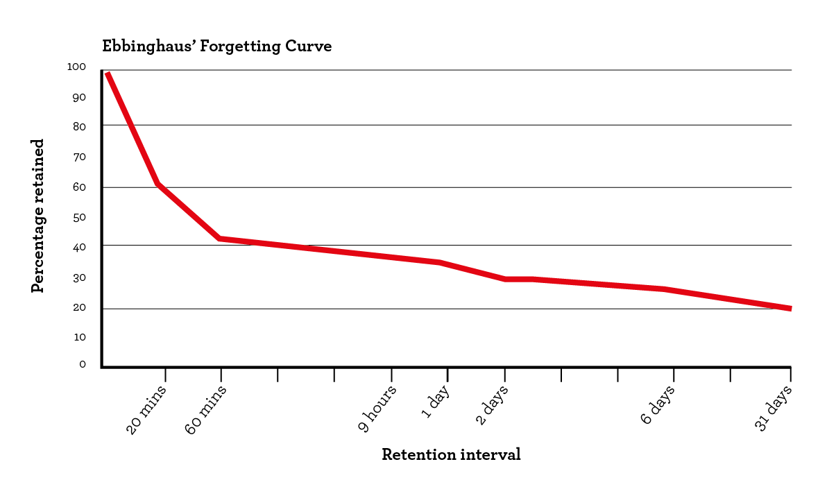
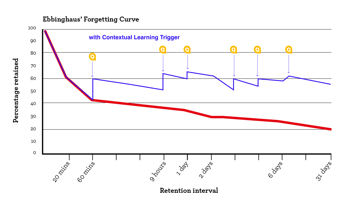
The forgetting curve shows how a memory of new information decays in the brain, with the fastest drop occurring after 20 minutes and the curve leveling off after a day.
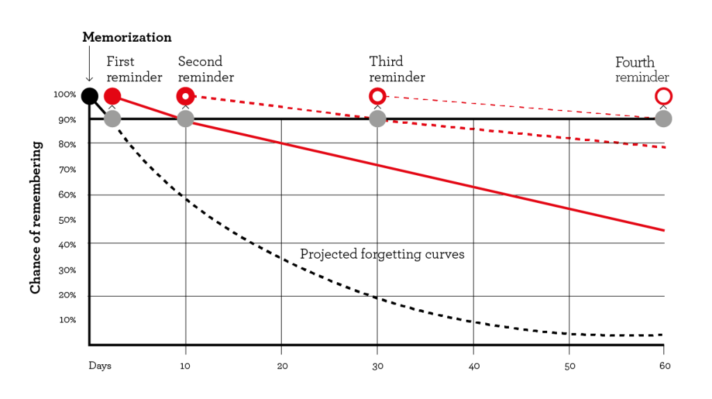
Study shows we need to recall or revisit the information after we originally come across it. Going over the information later, at intervals, helps us remember a greater percentage of the material.
However, the challenge is that professionals are frequently occupied during the day and fatigued after work. The last thing they want to do is review tedious and irrelevant materials.
SOLUTION
Contextual Learning as Reminder
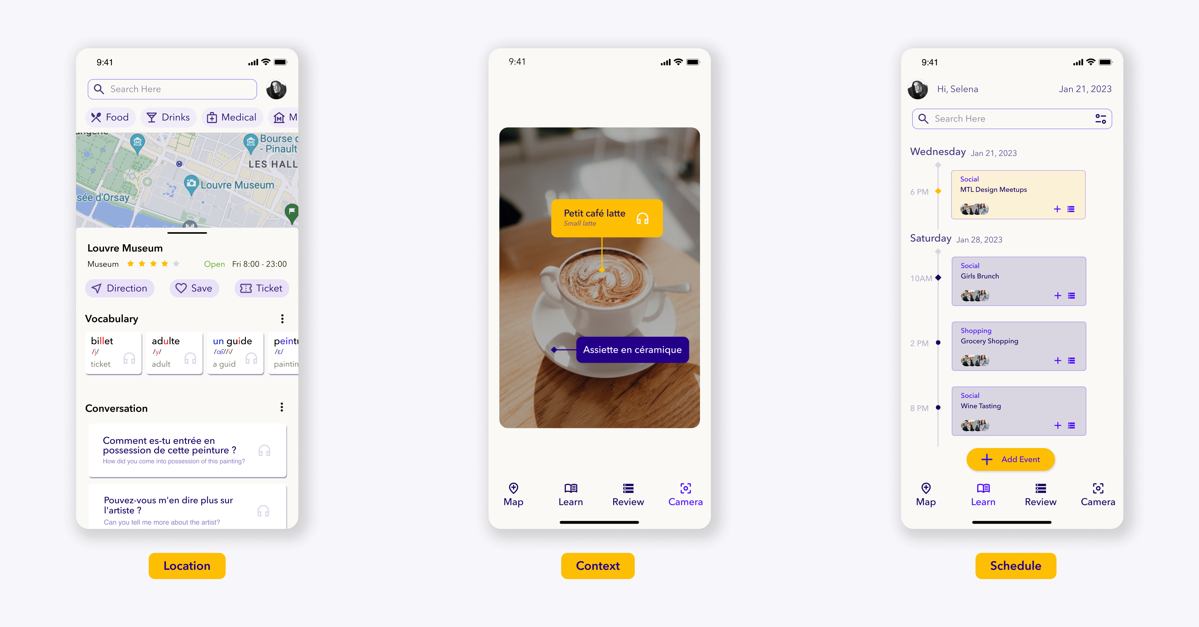
Birdy.io offers contextual learning materials as reminders/triggers to help mitigate the forgetting process.
Rather than repeatedly revisiting tedious and irrelevant materials, users have the option to review and practice relevant materials that align with their surroudings and schedule.
Phase One
Finding The Right Problem
Step 1 » Understand competitors
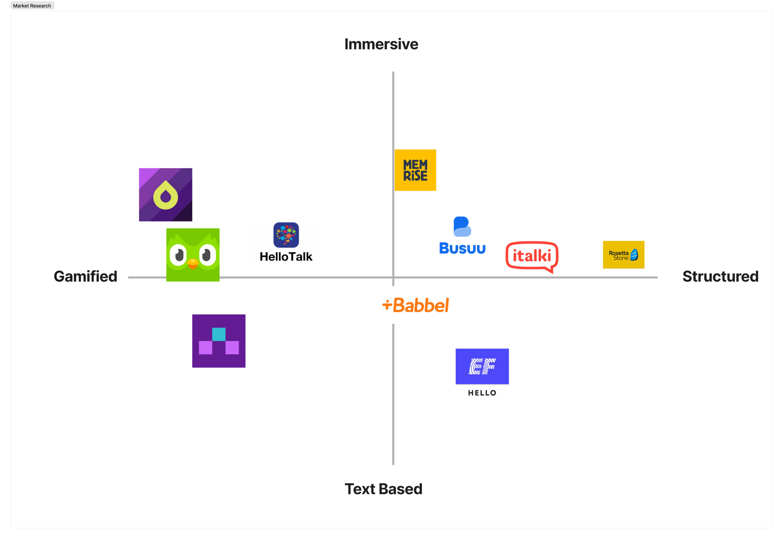
Overall, language-learning apps can be broadly categorized into the following four categories:
- Gamification: These apps use games and visual elements to enhance motivation.
- Rigorous structure: They follow a structured approach similar to traditional textbooks to facilitate learning progression.
- Scenario-based learning: These apps employ real-life scenarios to aid in memorization and practical application of language skills.
- Tools: They offer various tools such as flashcards, language exchange platforms, and dictionaries.
However, regardless of the category, the learning content in most apps is often "spoon-fed" to learners. There is significant potential in allowing learners to have more control over what they want to learn. On the other hand, it's possible that the right questions haven't been asked, research has been neglected, or the cost of implementing such changes is deemed too high.
Step 2 » Research users
User Persona: Busy adults, including young professionals and students, who have a need for language learning due to relocation or other reasons, and enjoy exploring new places.
I conducted interviews with five potential users to gather insights about their experiences with learning a new language while managing a busy lifestyle.
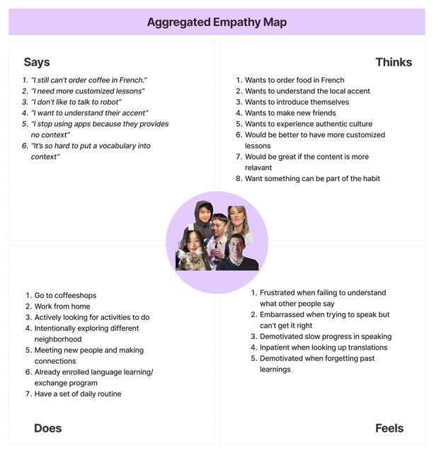
Utilizing Aggregated Empathy Map allowed me to contextualize the target audience, enabling me to identify patterns in their behaviors.
The main complaints identified during the interviews include:
- Difficulty in contextualizing words and phrases.
- Lack of personalized learning materials.
- Challenges in initiating and sustaining conversations.
Phase Two
Translating Feedback to Insights
Step 3 » Ideations
"How Might We"
Complaint #1:
Difficult to put words in context
HMW: How might we design an easy-to-use app for users to associate vocabulary with the right context?
Complaint #2:
Learning materials lack personalizations
HMW: How might we design an easy-to-use app for users to learn the most relevant materials and create their own?
Complaint #3:
Challenging to initiate & continue a conversation
HMW: How might we design an encouraging app for users to improve their speaking skills?
"Crazy" Ideas
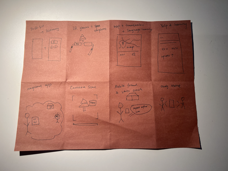
I generated 8 user-centered ideas.
- A To-do list + AI dictionary, where users can write down today's task; the associated vocabulary & conversation will be auto-generated by AI.
- A pair of smart glasses that simultaneously translate the subject and pronounces the words.
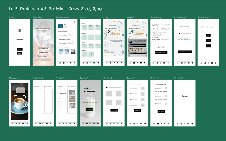
- Language learning + Google map, which generates extensive vocabulary & conversations based on the categories, pictures, and website information collected on Google map.
- Language learning + Yelp, which turns merchants' info & reviews into learning content.
- Neighborhood-based learning app, which helps users discover new things within the community.
- Camera dictionary, which allows users to scan a subject, learn the pronunciation, and add it to the list.
- Location-based voice coach, which teaches users how to pronounce things from their surroundings
- A local language mate matching platform based on location, schedule, and levels.
Step 4 » Making creative choices
"What is the user currently doing? How can we make their learning 10 times easier?"
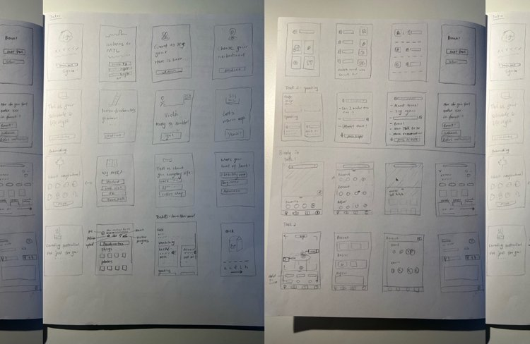
I decided to explore opportunities that align with the user's mental model while also being more creative in slowing down the forgetting process. I began creating low-fidelity prototypes for two potential products after drafting my very first wireframes.
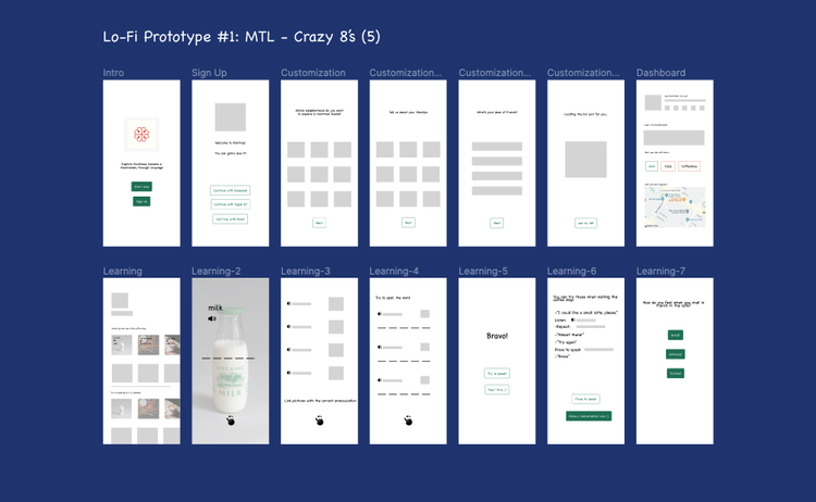
Idea #1: MTL is neighborhood-based learning. It's designed to be personal and local. Imagine a user settling down in a French-speaking city. This app allows her to learn useful French and establish meaningful connections within the community.
Idea #2: Birdy.io is designed to be immersive and customizable. The user can learn French from valuable and relevant content, no matter where she goes.
Step 5 » This or That: Problem-solution Fit
I aimed to gather user feedback on two ideas and determine which one would significantly enhance their learning experience without disrupting their hectic schedules.
Result: More participants chose idea #2 over idea #1
- ✅ The map function is novel and well-received by the user check.
- ✅ Positive reviews on the camera function too, but it would be better with a bookmark option.
- ⛔️ The To-do list function causes ambiguity and anxiety. Many participants said they wouldn't use it.
Phase Three
Design - Test - Launch
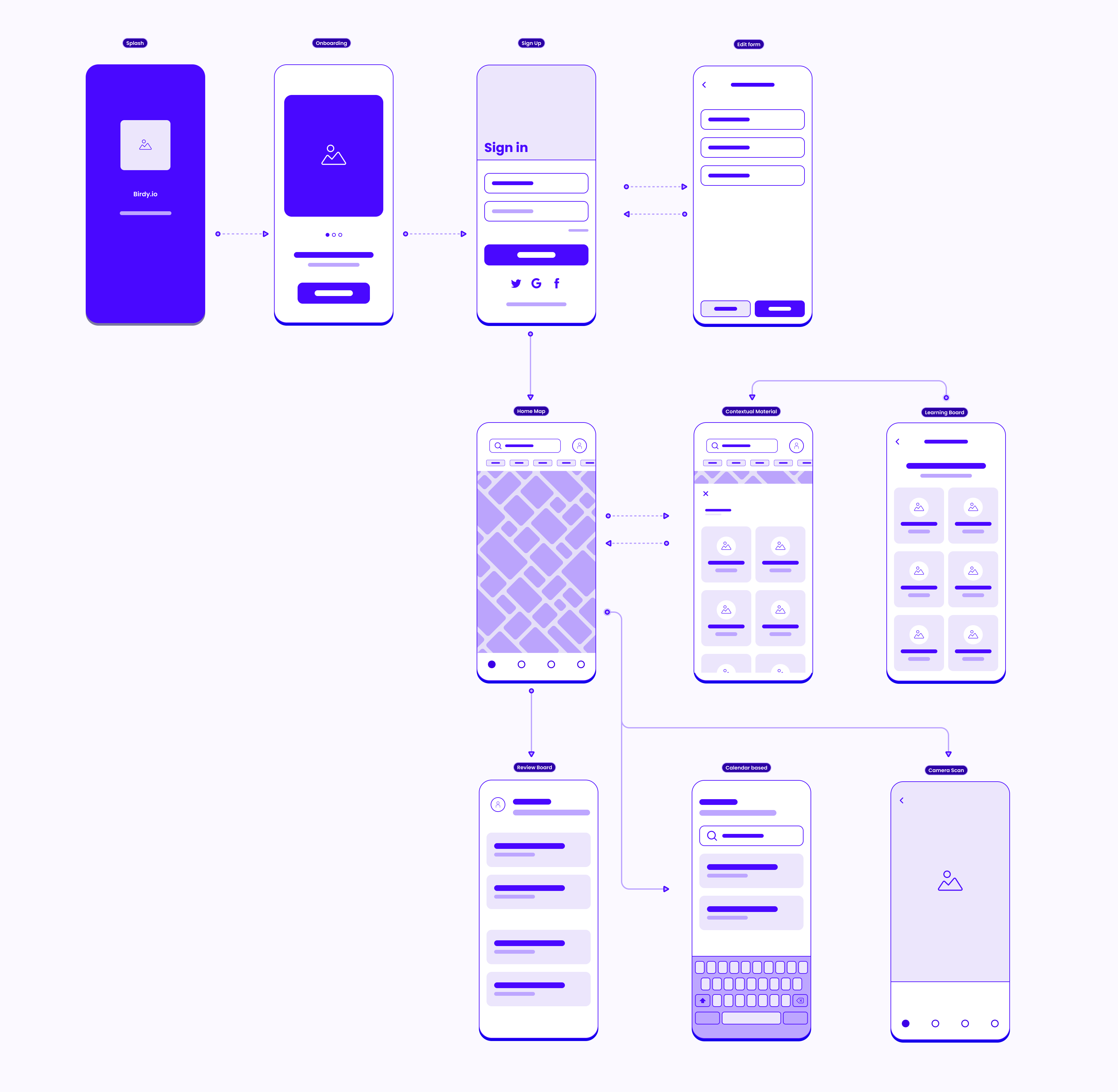
User Flow Chart
Final Design
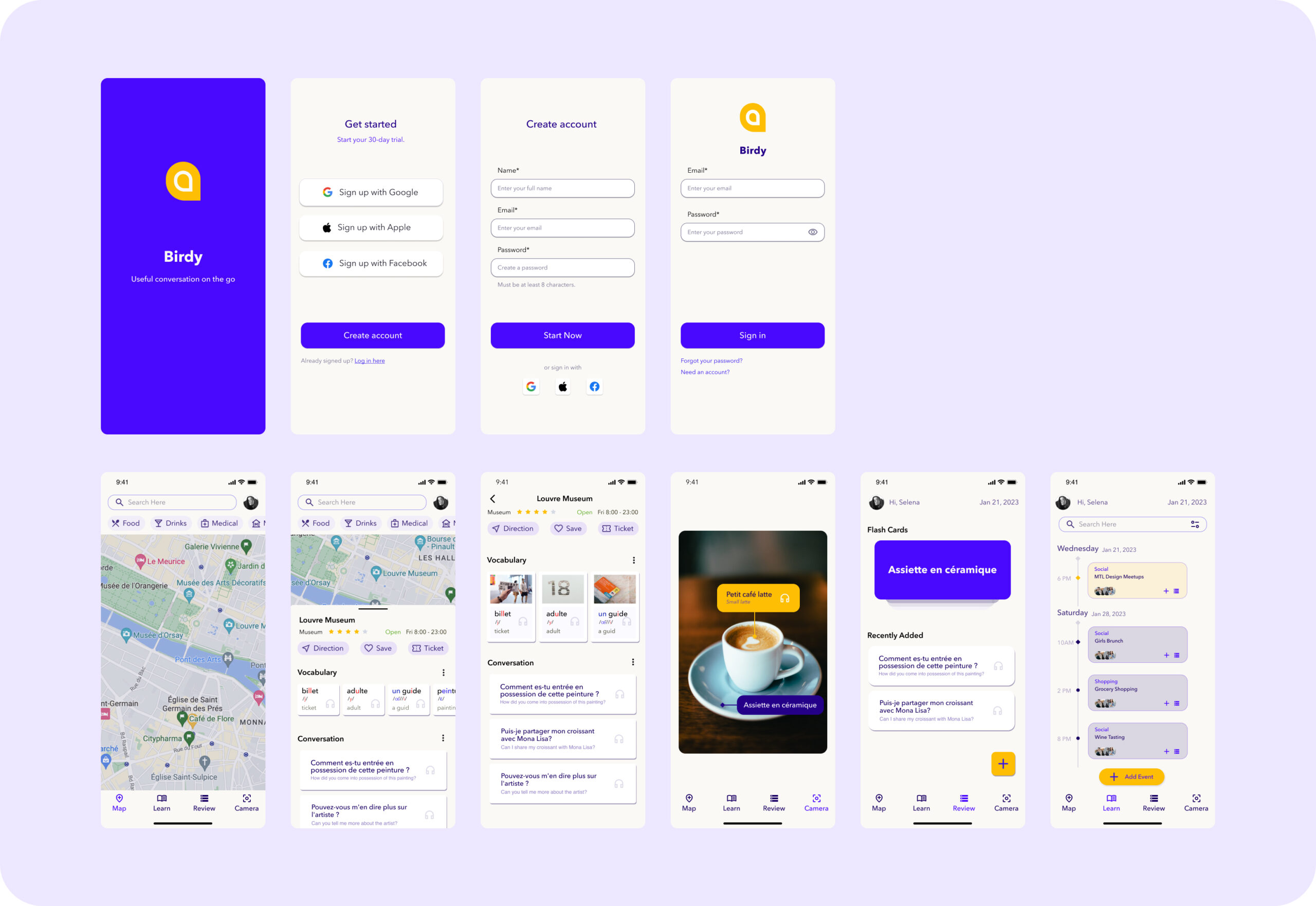
Clickable Prototype
Reflection
Know When to Wear Which Hat
The end-to-end design process requires the designer to wear different hats in each phase. In this project, I learned to consciously switch between these different roles.
Initially, I was solving a problem for myself. I was deeply invested in the idea of neighborhood-based language learning. However, after conducting a few interviews, I realized how much my emotions as a lonely immigrant were influencing my perspective. I recognized that I was wearing my "entrepreneur" hat, and confirmation bias was obstructing my judgment.
I then learned to put on my "researcher" hat: to be empathetic, but not swayed by personal biases.
I discovered the importance of active listening. When a user says, "I have nobody to talk to," it may not necessarily mean they need a speaking partner. It could be that they are unsure about "what to talk about." When wearing the researcher hat, I must remove unnecessary layers until I can uncover the core issue.
See more
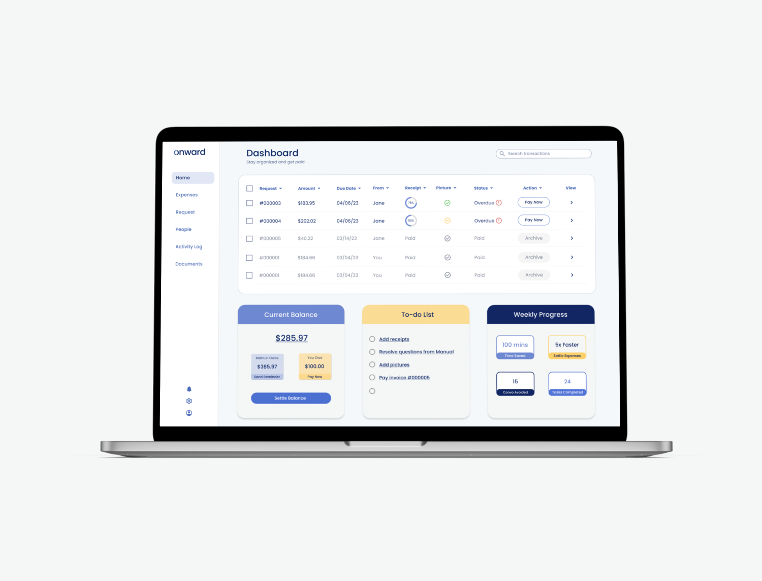
Uncover opportunities to improve customer retentionUX Research & Design | Fintech | Invoicing App
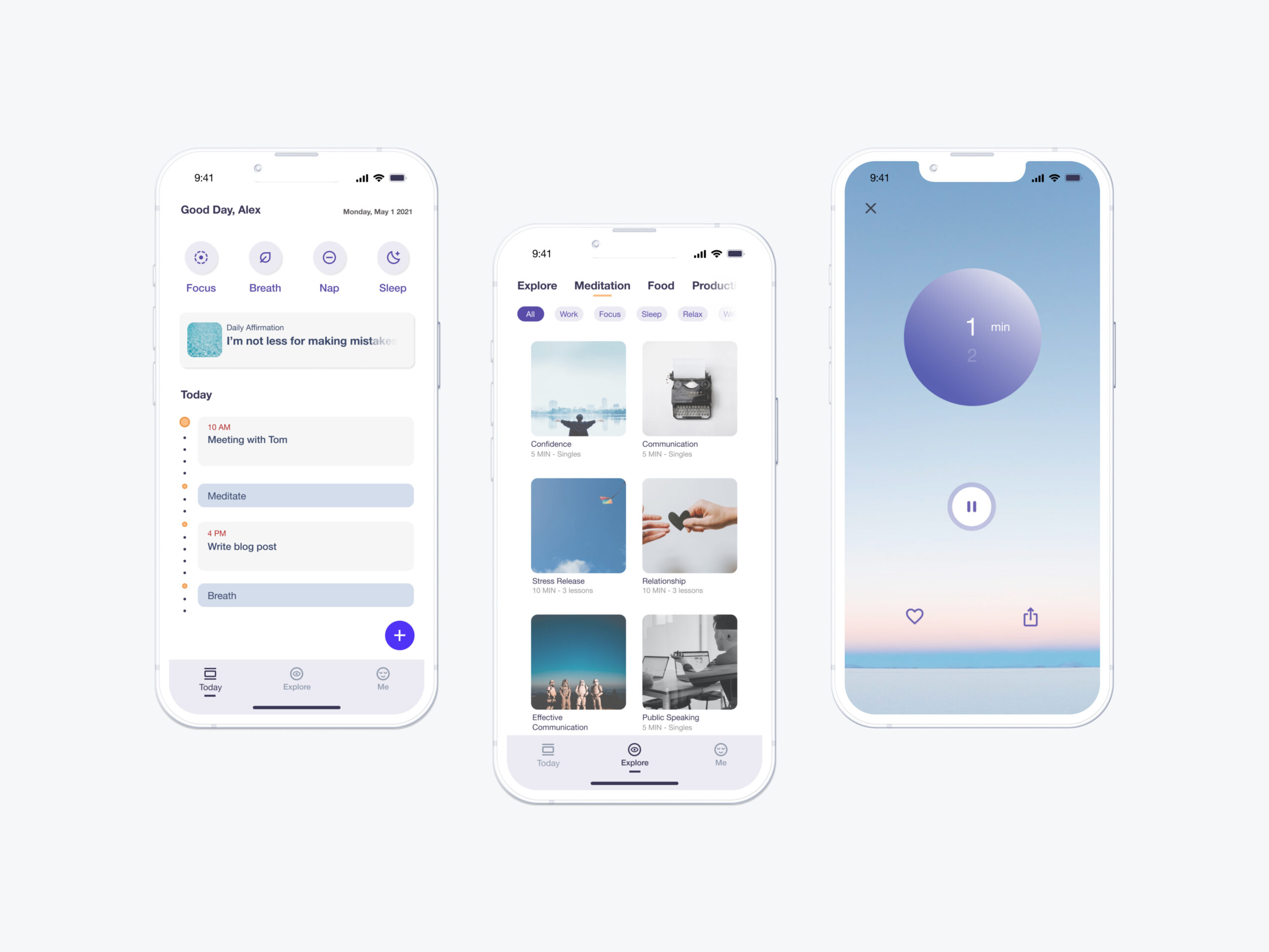
Enable fractional wellness to boost productivityConceptual UI Design | Wellness | Mobile App
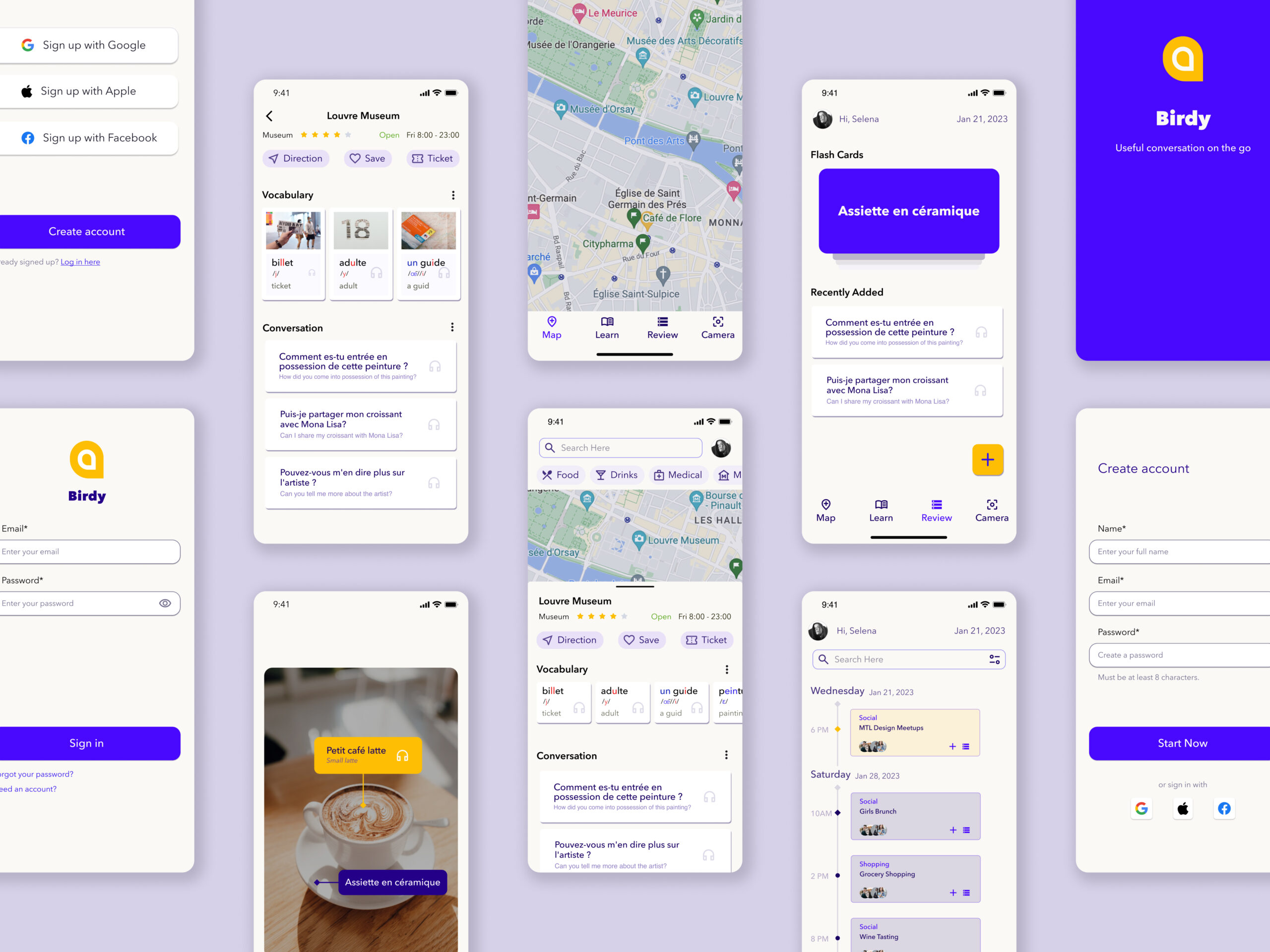
Facilitate contextual learning to mitigate the forgetting curveEnd-to-End UX Design | Education | Mobile App

Reinvent skirts to empower mobility in styleProduct & Business Design | E-commerce
© Viya Qu 2024
