Onward
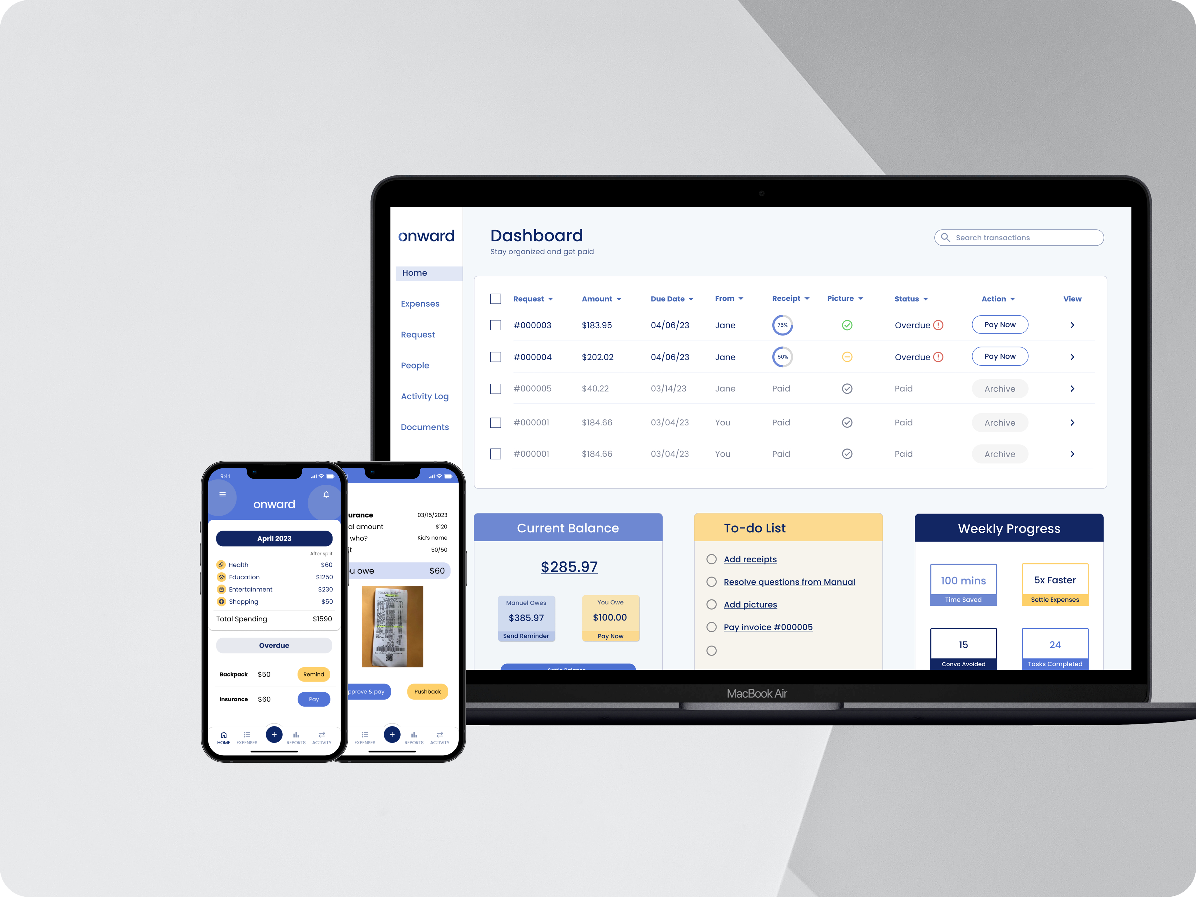
Onward is a FinTech startup helping divorced parents in managing shared expenses effortlessly. I joined the product team to enhance the repayment experience and identify opportunities for improving customer retention.
MY ROLE
UX Researcher & Product Designer
TEAM
Product Manager
TOOLS
Figma, Dovetail, Miro, Respondent, Excel
Problem
As Onward's user base grew, retaining customers became increasingly challenging, especially with competitors expanding their offerings.
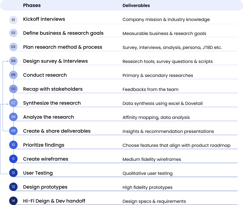
Process
Insights
Divorced parents want collaboration, not communication, in a self-protective way.
- They interact contractually. The divorce agreement has a lasting impact on the co-parenting relationship.
- They count every penny but only bother to communicate big expenses. Because sharing expenses can trigger old habits.
- They track expenses for emotional reasons. They desire a sense of fairness, respect, and security.
- They seek shortcuts in expense settlements. They make efforts to avoid confrontations.
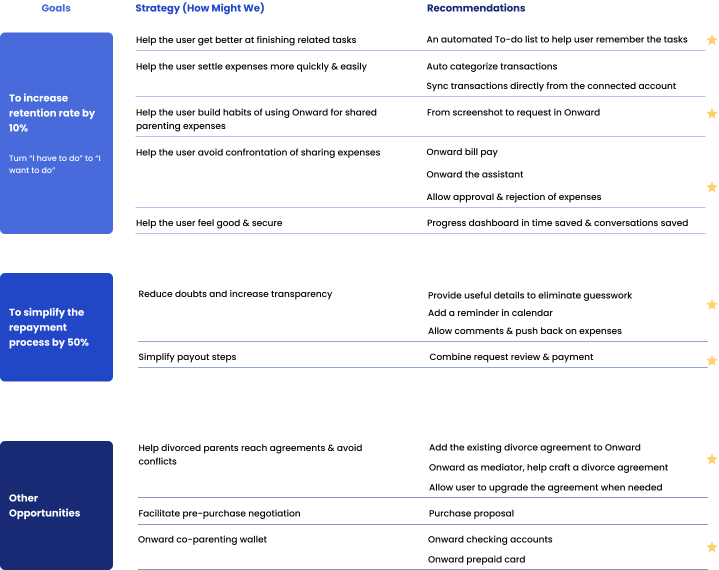
Recommendations
Divorced parents prefer to settle expenses without having to communicate directly with their ex-partner, and they hire an app to do so.
To alleviate additional burdens on them, my recommendation for Onward was to facilitate "Zero communication, 100% repayment" for divorced parents.
Research & Design Process
Aligning research questions to business goals
- Increase retention rate by 10%
- Simplify the repayment process by 50%
- Uncover opportunities to augment the product roadmap
- Understand user behavior and mental model for managing shared expenses and repayment by April 30, 2023
- Analyze the user’s Job-To-Be-Done in requesting and settling shared expenses by April 30, 2023
- Identify product opportunities to formulate recommendations that align with the current product roadmap by May 5, 2023
Forming null hypotheses
- Our target customer tracks shared expenses for external & logical reasons, such as providing evidence to the court, managing personal finance, and making informed purchase decisions for their children. – Rejected
- The repayment process is linear and "one and done". – Rejected
Selecting the appropriate research methods
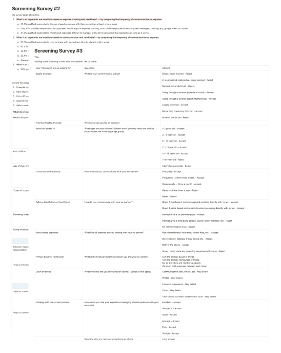
- Survey (4 online surveys with target customers)
- User interviews (interviews with 10 qualified participants)
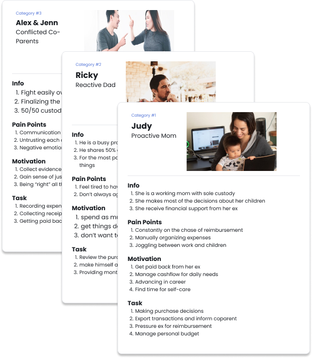
- User personas (5 proto-personas, 3 user personas)
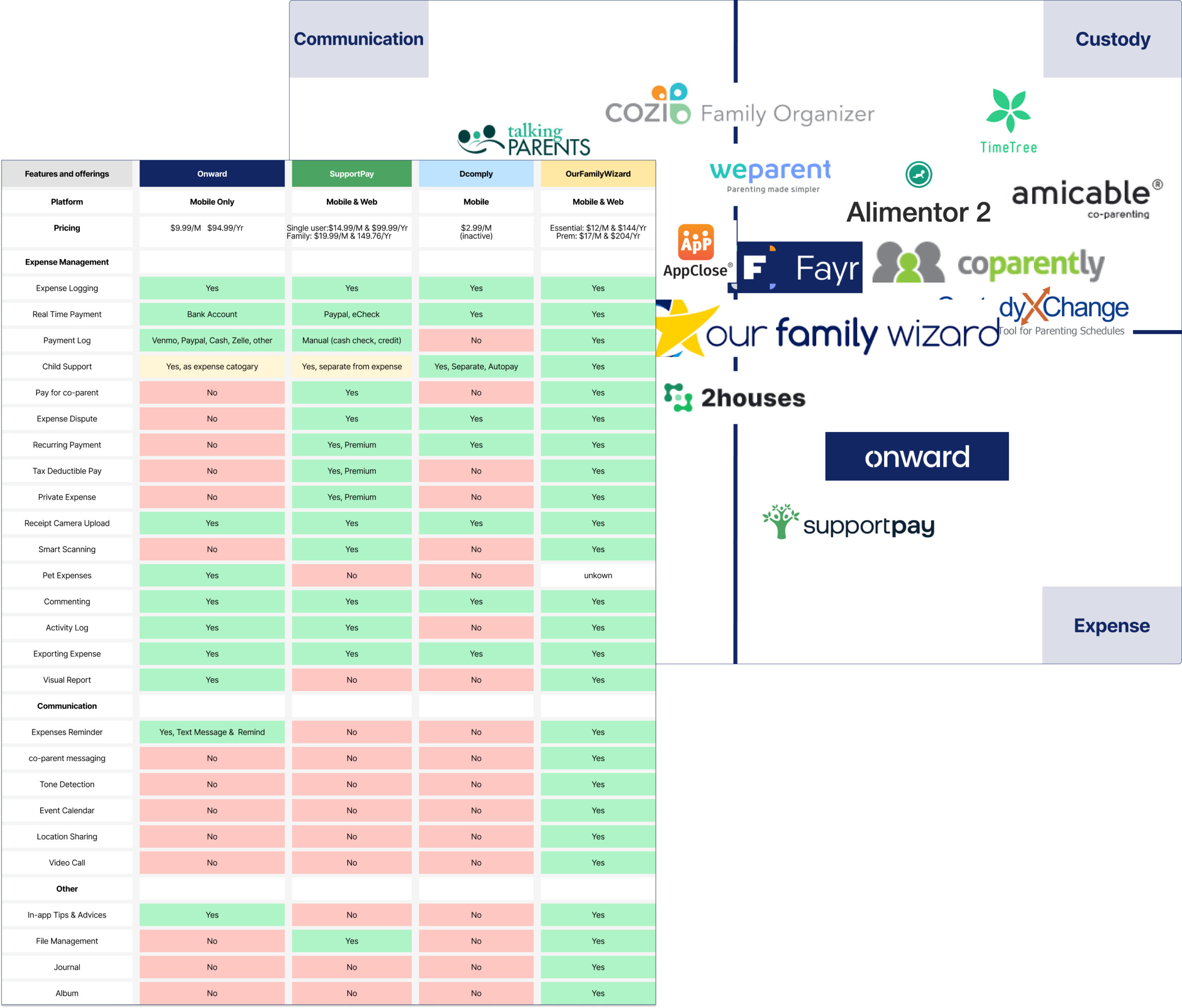
- Competitive analysis (2 main competitors & 13 other players)
- User testing (2 moderated user testings)
- are legally divorced
- have at least one kid under 18 years old
- communicate directly via text or email
- share parenting expenses
Reflecting & testing on repeat

Facts & Insights
SURVEY RESULTS
1. Managing shared expenses is more time-consuming and argumentative than other shared responsibilities.
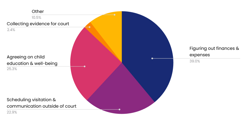
Co-parents find figuring out finances and expenses more time-consuming and argumentative than scheduling the visitation and agreeing on the child's education & well-being.
2. Managing shared expenses is a very manual process.
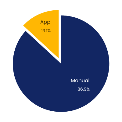
86.9% of participants rely on email & excel, even memory, to track shared expenses and are mostly unaware of digital tools.
3. Communication dynamics influence the experience of managing shared expenses.
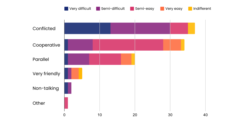
More conflicted co-parents find managing shared expenses very or semi-difficult.
4. Tracking shared expenses serves bigger motivations.
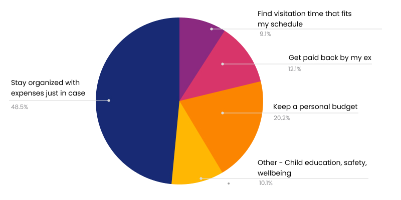
A sense of fairness, self-protection, personal budget, children’s well-being, etc.
INTERVIEW DATA

- to “hold the ex accountable”
- to “be fair”
- to protect themselves when “shit hits the fan”
- to “show that I’ve been doing a lot”
- to “be able to trust again”

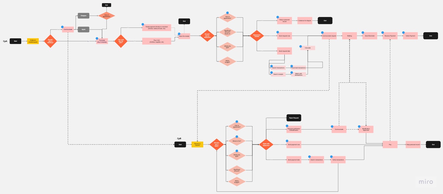
4. Request & repayments are not linear processes.
Divorced parents seek shortcuts to save time, money, and back & forth conversations.
Redesign
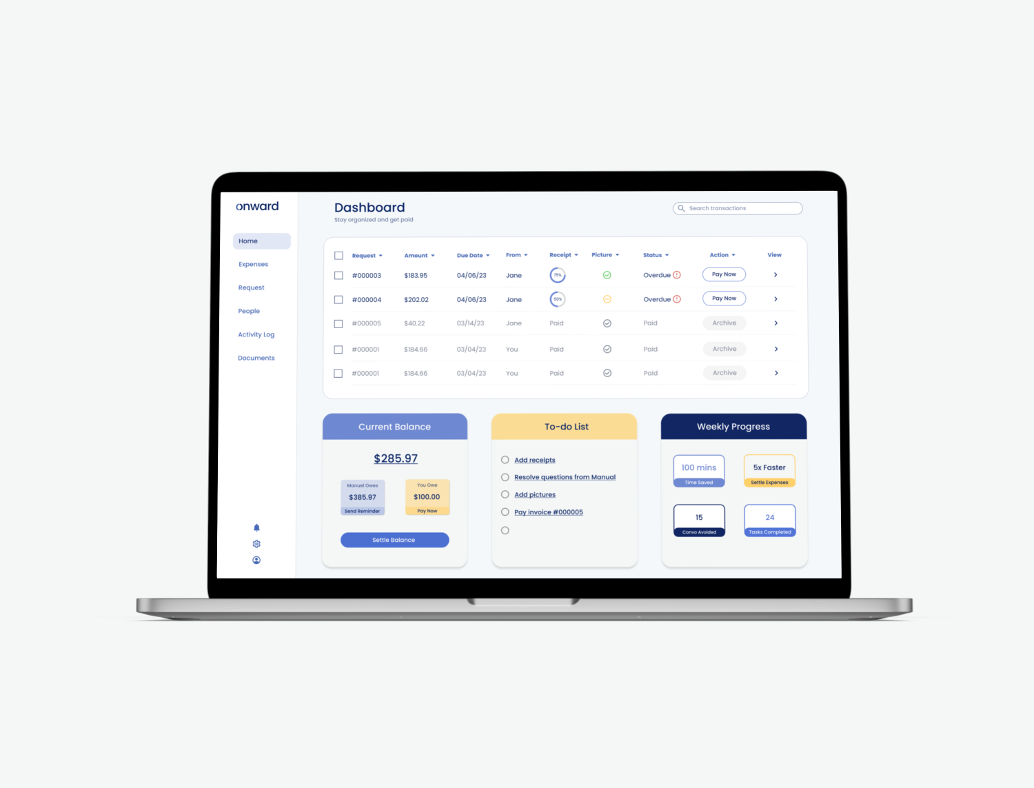
1. Help the user better manage shared expenses and feel good after.
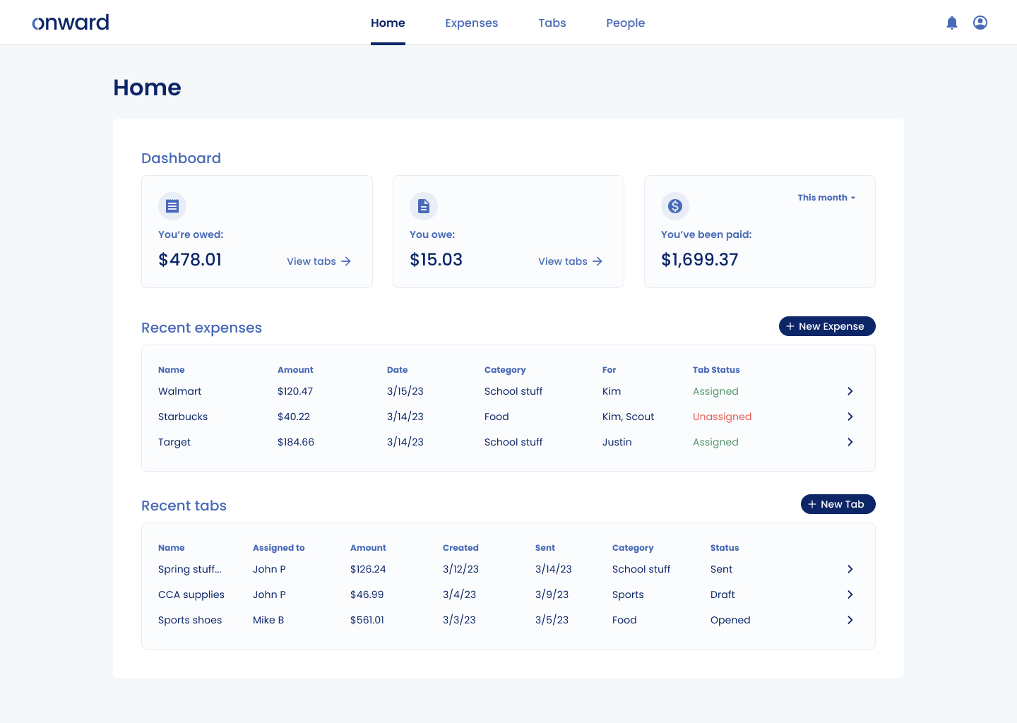
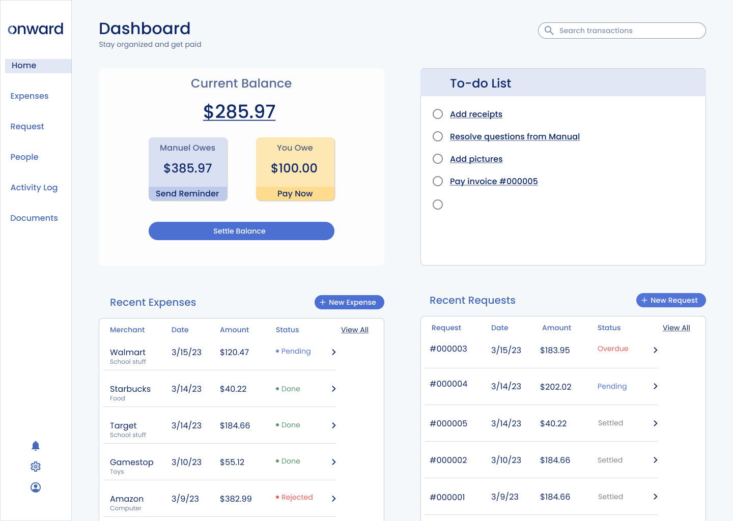
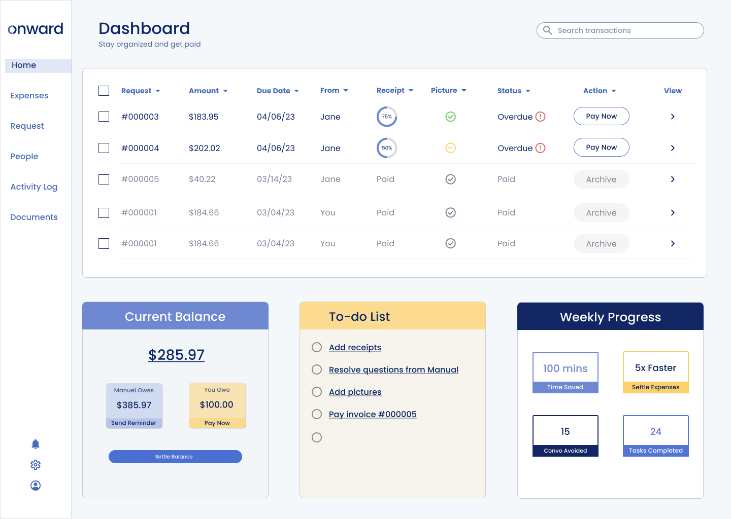
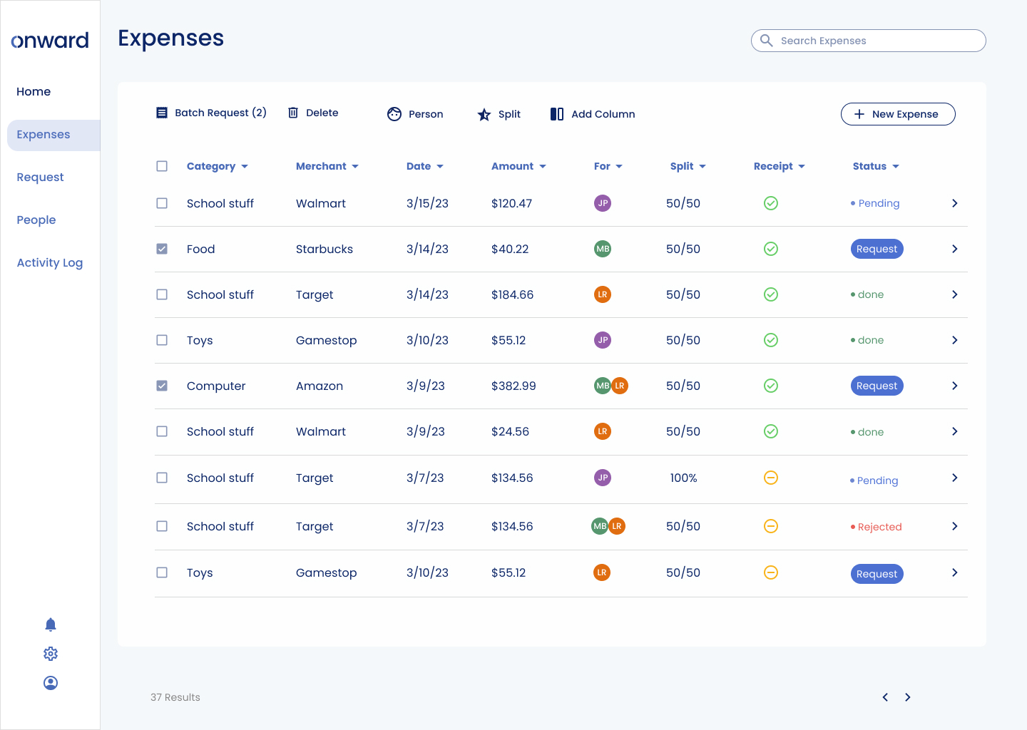
»» The current design focuses solely on the display of information. In contrast, the redesign prioritizes action & progress.
2. Help the user get tasks done faster and easier.
»» The redesign allow users to batch edit, assign, request, and search expenses.
Original
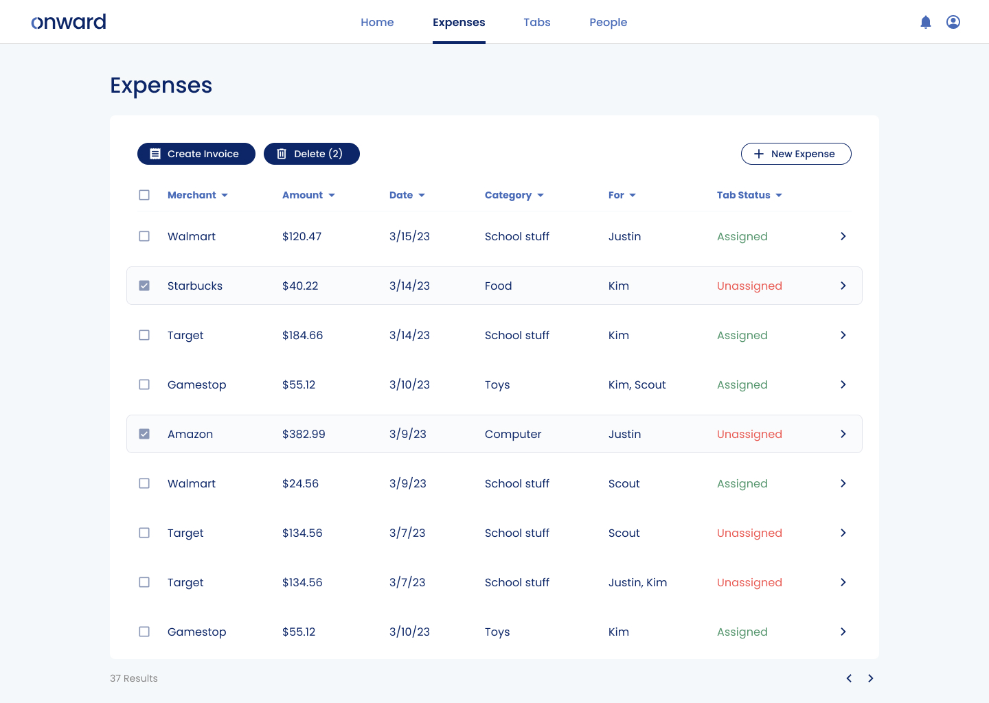
Redesign: batch editing & sending
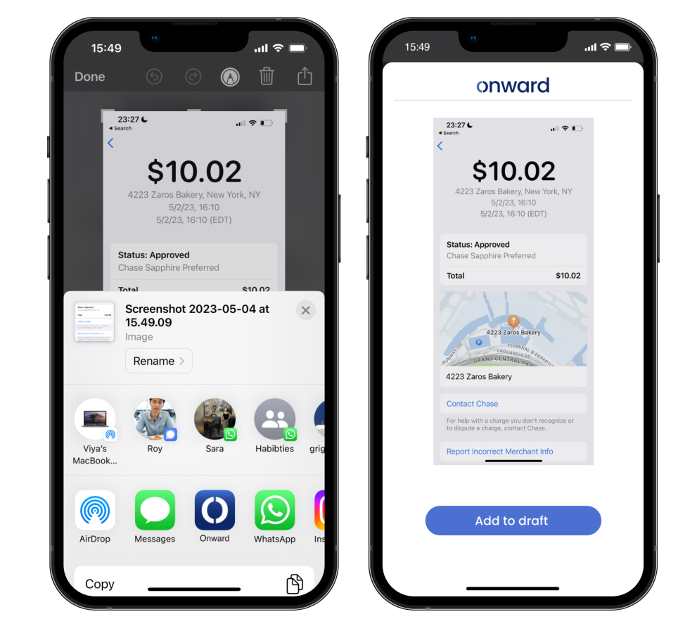
3. Streamline expense uploading.
»» From screenshots to expense requests. Right after a purchase occurs, the user can forward screenshots to Onward, edit directly, or save them to draft.
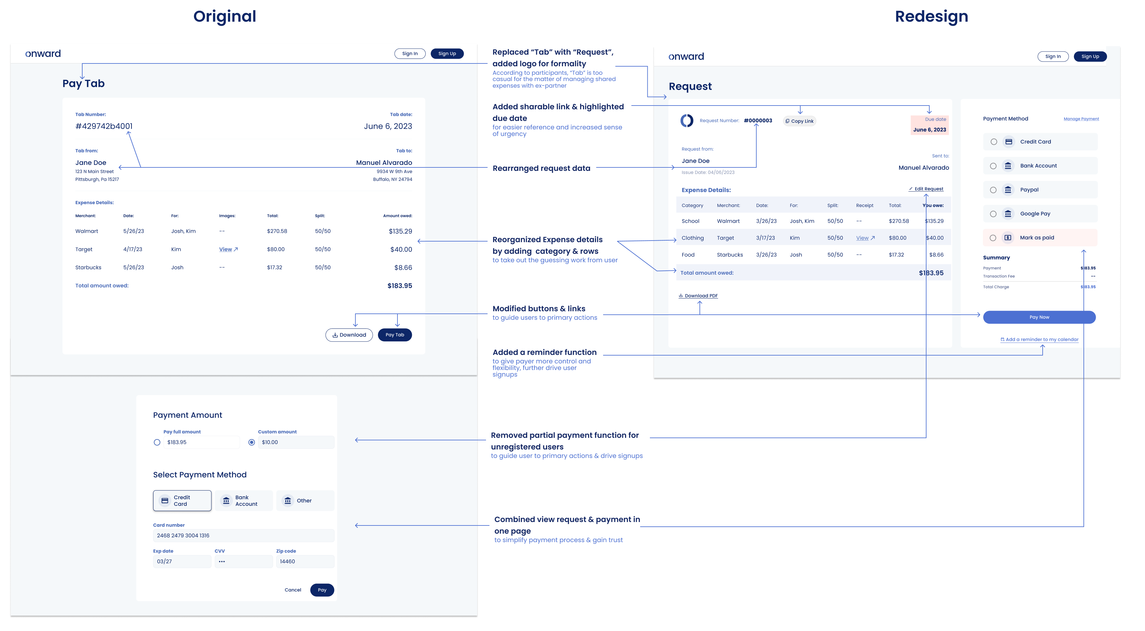
4. Simplify payout process.
»» The redesign cuts payout steps by 50%, and allows users to edit & set a reminder to pay later.
What could I improve?
One significant challenge lies in recruiting participants from platforms like Userinterviews.com and Respondent. These platforms often incentivize participants to provide "right" answers, leading to research biases. For instance, our initial interview, which required hours of preparation, turned out to be disappointing due to biased responses. This experience has taught me the importance of setting realistic expectations, improving survey design, conducting follow-up surveys, and employing various research methods to mitigate biases.
See more
Uncover opportunities to improve customer retentionUX Research & Design | Fintech | Invoicing App
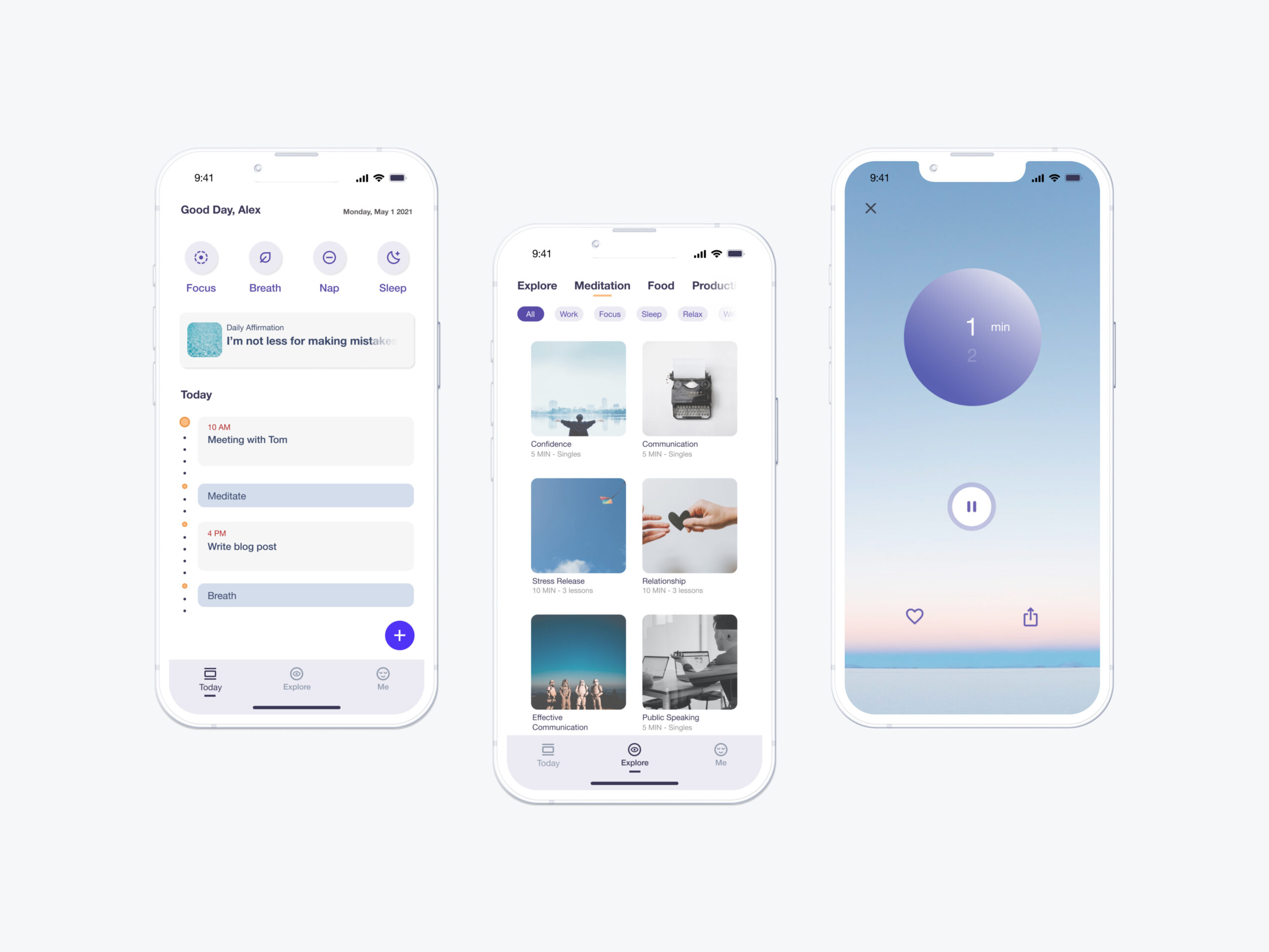
Enable fractional wellness to boost productivityConceptual UI Design | Wellness | Mobile App
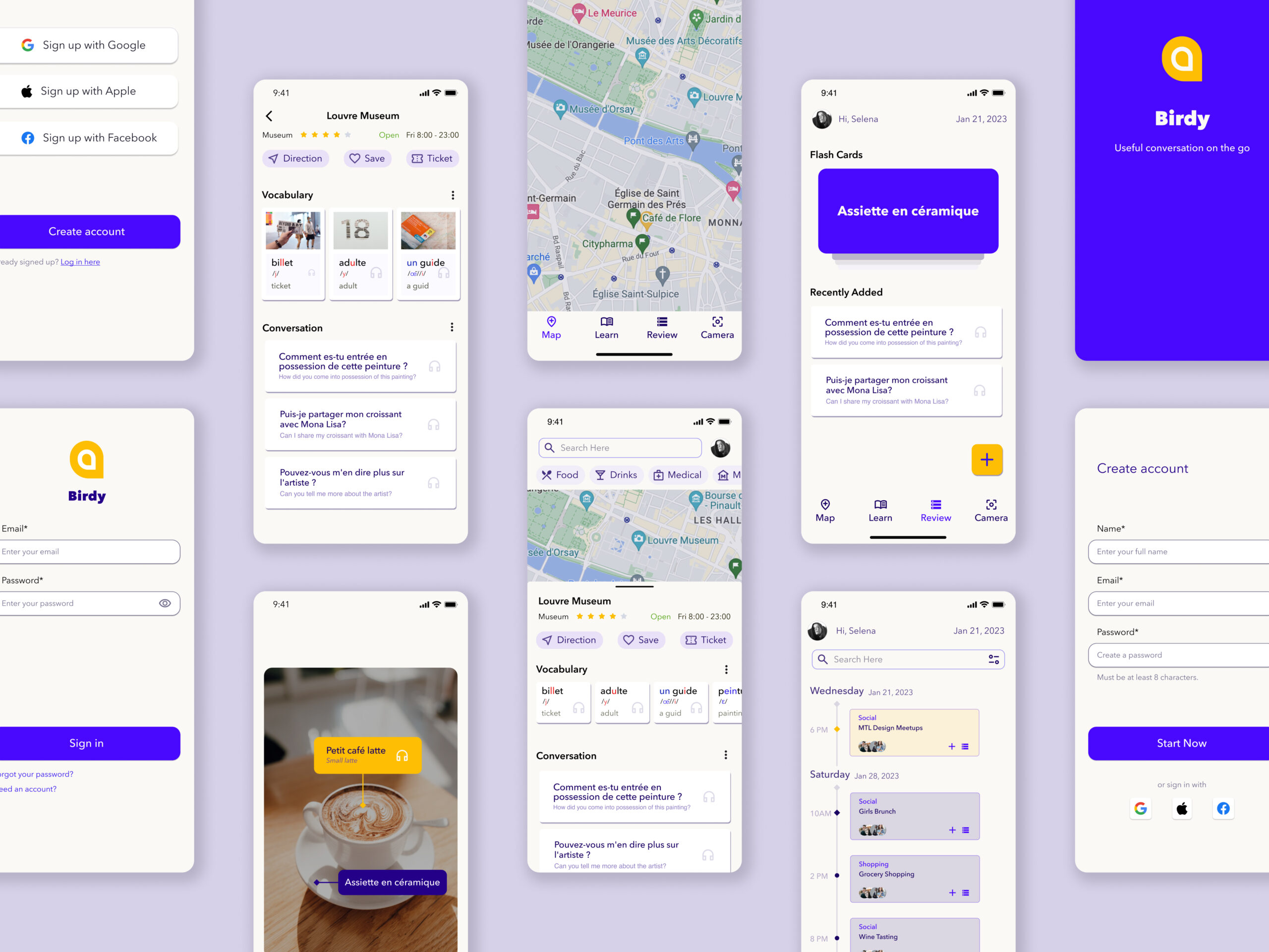
Facilitate contextual learning to mitigate the forgetting curveEnd-to-End UX Design | Education | Mobile App

Reinvent skirts to empower mobility in styleProduct & Business Design | E-commerce
© Viya Qu 2024
